- HEALTHCARE
- WEB APP
- B2B2C
Generation LabKit Register Flow
Four stakeholders came to me with four different requests. This is how I redesigned Generation Lab's kit registration flow by questioning every brief.
01
Introduction
An Opportunity to Rebuild Trust Through Registration Redesign
Generation Lab had been running registration and onboarding through a third-party vendor. We were bringing the entire flow in-house, which meant rebuilding it from scratch, and inheriting every complaint the team had been collecting against the vendor version for months.
I led the redesign as the only designer, partnering closely with our PM and 2 engineers and had weekly design reviews with CEO and COO.
ROLE
Product Designer
Lead end-to-end
DURATION
2 Sprints
4 weeks in Apr'26
TEAM
PM, Eng, Founders
Cross-functional
DEVICE
Mobile + Desktop
Web App
02
Background
SystemAge™ Test and Registration Flow
SystemAge is an at-home DNA methylation test that measures biological age across 21 organs and systems. Before users can ship their blood sample to the lab, they need to link their physical kit to their account and learn how to collect the sample correctly.
So, registration is the bridge between buying the box and getting accurate results.
step 01

Blood Collection Kit
SystemAge™, core product
step 02

Register the Kit
To track sample & report
step 03

Do the Test
Using Tasso™ device
step 04

Get Report
About aging status
03
The Thesis
Stakeholders Were Describing Symptoms. My Job Was Not Only To Fix The Problem But Also To Find The Architectural Solution.
Each chapter below follows the same four beats: the ask (what someone said was broken), the reframe (what I actually found), the decision (what I designed), and the result (what changed).
Chapter 01
Clinician Login Problem
REFRAME THE ASK
From Login Friction to Different Theme
THE ASK
Customer Experience — Support requests growing weekly
“Clinicians can't log in. Can we look at the auth flow?”
THE REFRAME
After auditing the requests — it wasn't authentication problem
“Clinicians were on the client portal trying to log in. The two portals looked identical.”
THE DECISION
A Different Theme for a Different User.
Engineering's first instinct was to add a more prominent link redirecting clinicians to the provider portal. I pushed back. A link is something users have to read and act on, by the time they see it, they've already typed their email into the wrong form.
A color change does the work earlier before any copy is read. A clinician arriving at a gold pagenow knows within a glance that they're somewhere wrong.
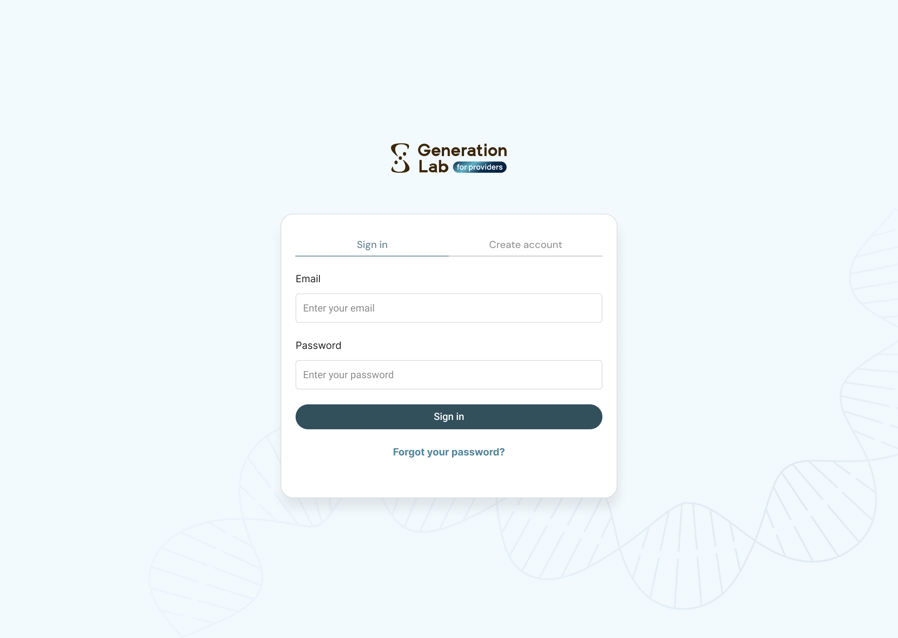
FOR CLIENT
FOR PROVIDER
THE RESULT
Clinician support requests about login quieted down. Sales had also started educating providers at intake around the same time, so I won't claim the color split alone did it. What I can claim: no engineering time went into debugging an auth flow that was never broken.
Chapter 02
Data Tracking Inaccuracy
REFRAME THE ASK
Many Users Never Reach the Finish Line
THE ASK
Engineer failed to track confirmation date a lot of times
“Users keep skipping the confirmation button. Can we put it at the top and bottom of the page?”
THE REFRAME
After running the flow on my own phone
“Two buttons won't help if users don't trust the page. The video doesn't match the kit, users are dropping out.”
THE DECISION
Clearer Layout and Trustworthy Instructions
Users were skipping the “I've collected my sample” button and that button is what writes the test date into the system. Without it, engineering had to infer timing from shipping date, and the report trend view ran on estimates instead of the real number.
The deeper issue was confidence: users were watching the video, opening the kit, finding the steps and packaging didn't quite match, and pausing. A more prominent button doesn't solve hesitation.
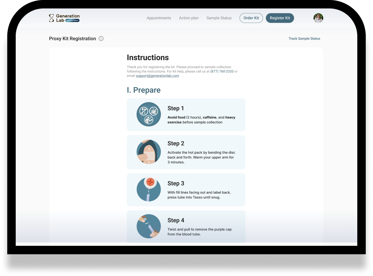
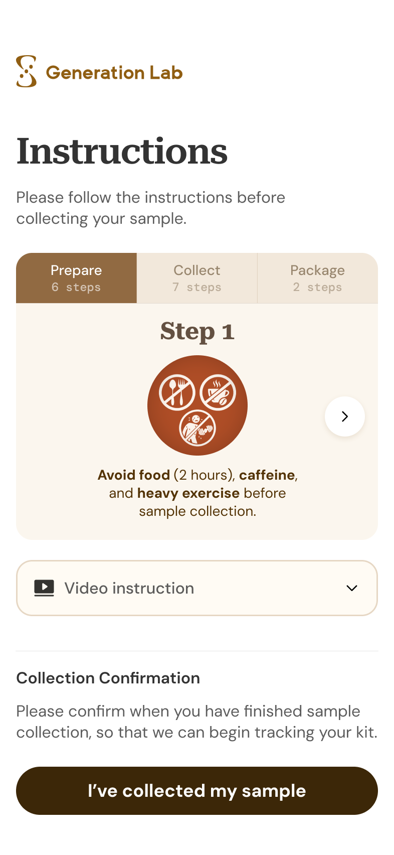
3 Layout Changes To Make The Process Clearer

Printed Instruction Mapped To The Digital Flow
* showcasing less steps for demo
CLICK ANYWHERE INSIDE THE CARD TO INTERACT
Step 1

Avoid food (2 hours), caffeine, and heavy exercise before sample collection.
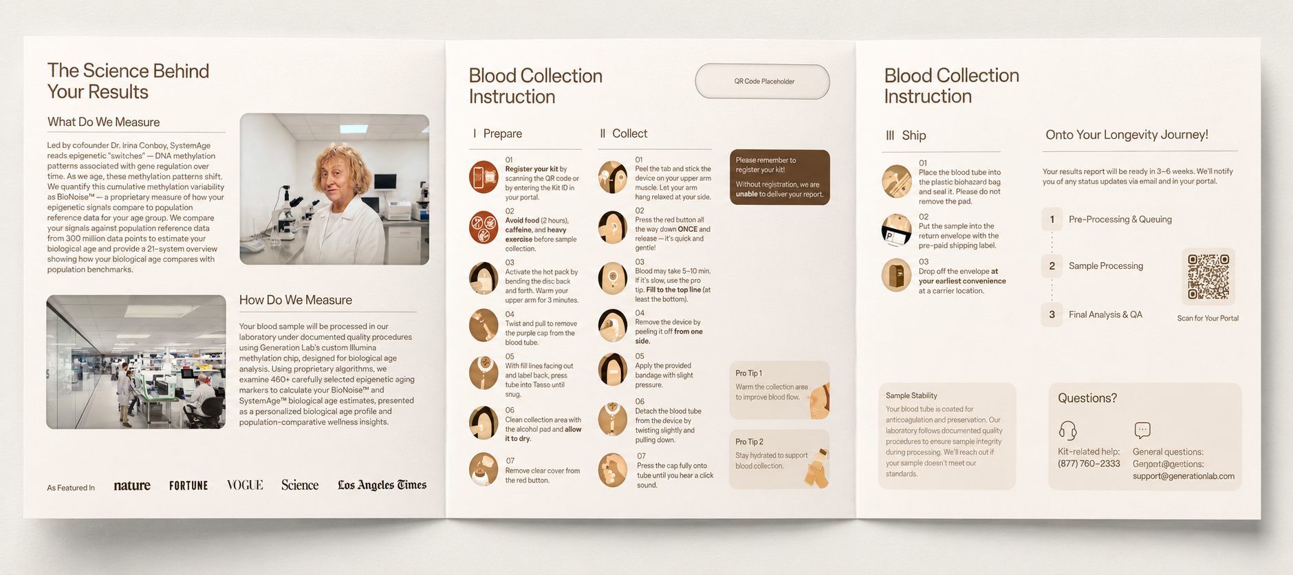
The physical instruction brochure (also redesigned by me!) in the test kit
THE RESULT
Once users had instructions they could trust and a button they could see, test dates started arriving in the system. The trend view ran on real numbers instead of inferences.
Chapter 03
Marketing Request From COO
REFRAME THE ASK
Visibility & Accuracy In The Same Redesign.
THE ASK
COO + Engineering — Ahead of the SystemAge 2.1 launch
“Highlight the new sex-specific results as our SystemAge 2.1 differentiator and reduce support requests from users correcting personal info.”
THE REFRAME
After mapping where the difference actually lives in the product
“The kit and collection steps are the same. The difference lives in the report and the sex-at-birth input was easy to misselect.”
THE DECISION
Turn A Hidden Field Into A Product Moment.
Two requests pointed to one field. The COO needed a launch story for sex-specific results. Engineering needed fewer manual fixes when users asked support to update personal information.
The kit and collection process are identical for everyone. The difference appears in the report calibration, so PM and I kept the emphasis on the report and the registration moment first.
Selection flow. Sex at birth moved out of the dense account form into its own step: two large choices, one sentence on why it matters, no surrounding fields.
Sex-at-Birth Selection Flow
BEFORE
AFTER
SELECT
A SEX

Tell us your
sex at birth
Biological aging follows sex-specific patterns. Your sex at birth will be used to calibrate your unique aging profile.
SEX AT BIRTH
Select your sex at birth to calibrate your results.
Sex at birth moved out of the dense account form into its own step: two large choices, one sentence on why it matters, no surrounding fields.
Sex-Specific Badge System
KIT PACKAGING
REPORT COVER
Rose-copper for female, sage-gold for male. The same circular badge then appears on the report cover, product render, and kit sticker, making the campaign consistent without implying a different collection process [sprint after registration flow].
THE RESULT
Same redesign, two jobs: Marketing got a consistent launch hook. Product got a safer calibration input.
Chapter 04
System Thinking
REFRAME THE ASK
A clinician shows the screen. A customer holds it.
THE ASK
COO + Engineering — Ahead of the SystemAge 2.1 launch
“Can one registration system support both clients and clinicians?”
THE REFRAME
After mapping real entry points
“Clients usually start from a QR code on mobile. Clinicians usually type a kit ID on desktop. The same system needed different defaults.”
THE DECISION
Design Around Where Each User Starts.
Responsive design would have shrunk the same layout onto a smaller screen. That wasn't enough, the contexts of use weren't just different sizes but different jobs.
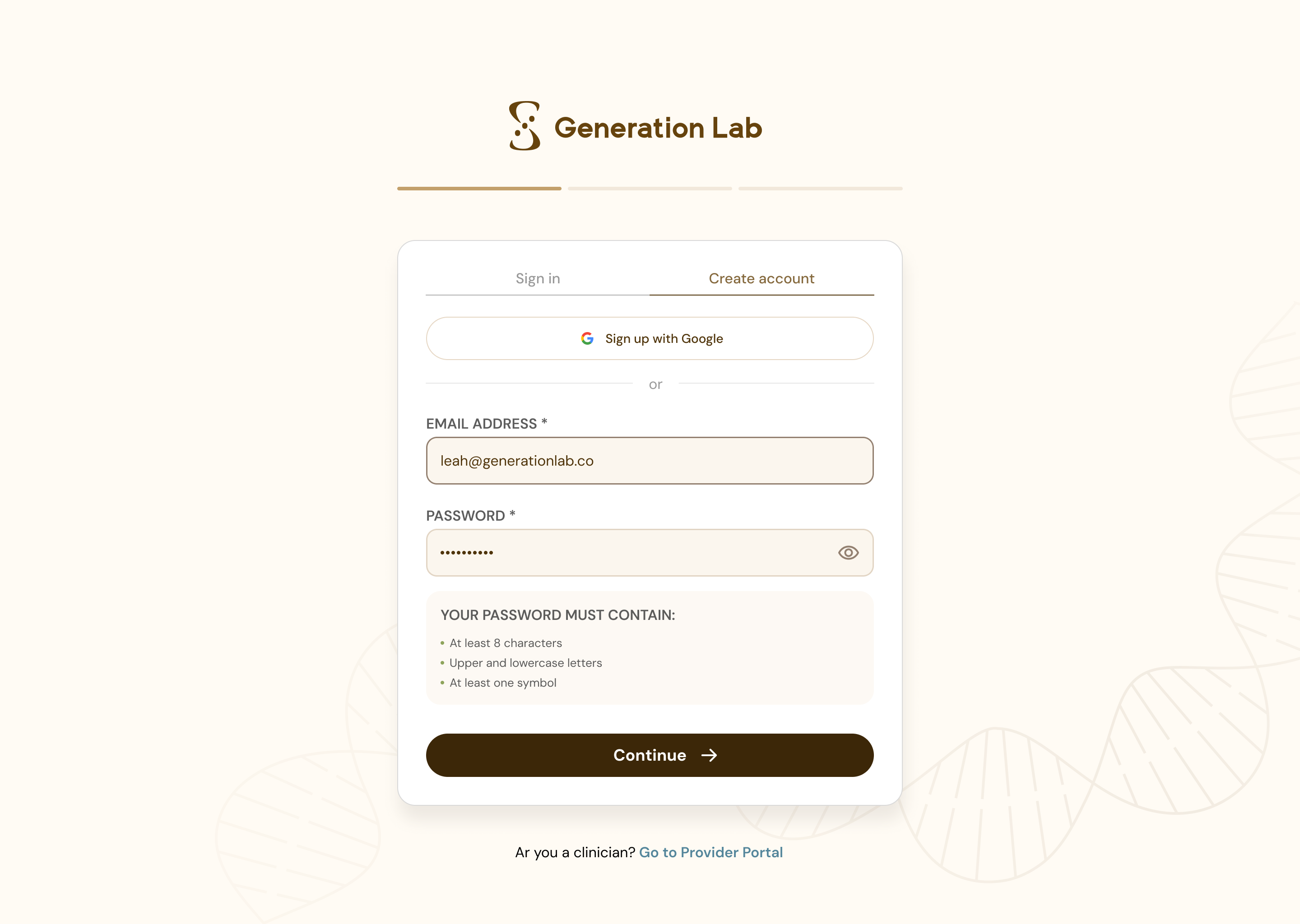
The Login Page
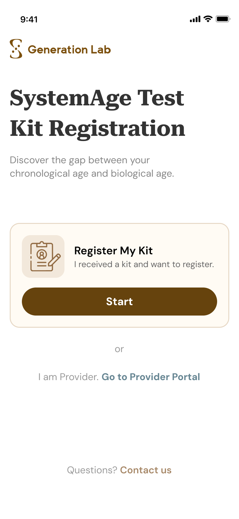
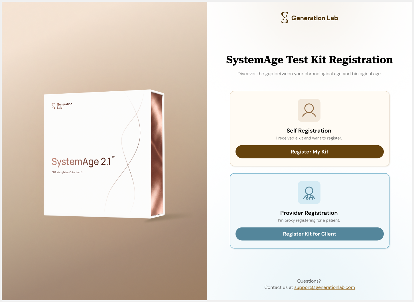
MOBILE
DESKTOP
Mobile prioritizes the QR-scanning customer: one clear “Register My Kit” card, with the provider path as a quiet secondary link. Desktop keeps both paths visible: clinicians can choose either workflow and easily walk a patient through the screen.
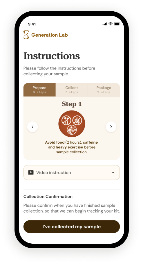
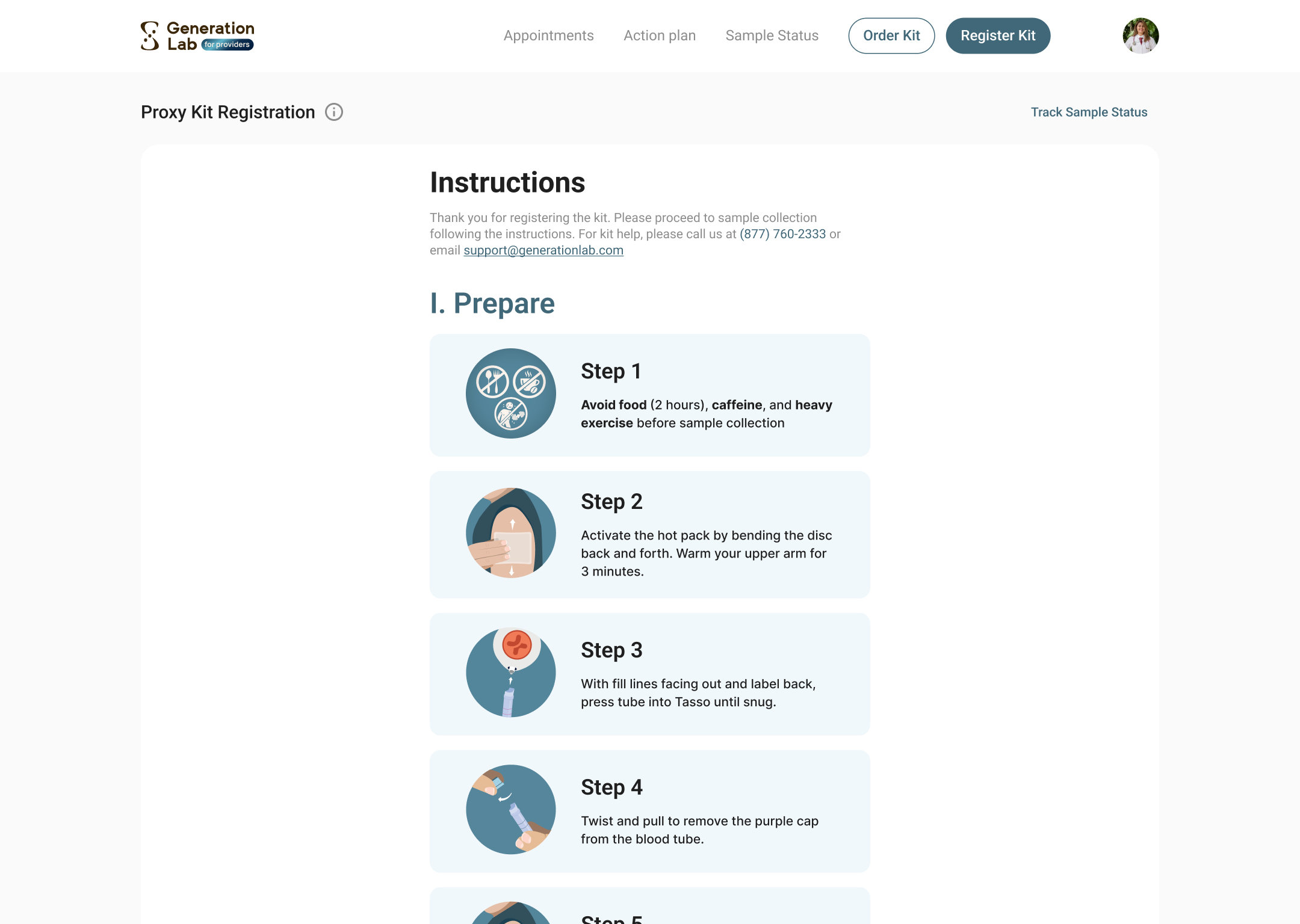
Instructions Flow
MOBILE
DESKTOP
Mobile breaks collection into a step-by-step card with three tabs. Desktop shows more steps at once, making it easier for clinicians to scan, manage, or show the process to a patient.
THE RESULT
The portal stopped forcing one compromise interface. Clients get a simpler guided path; clinicians get the visibility and control they need on desktop.
04
Outcomes
Achievements After Launch
~70%
Drop in clinician login support tickets after color-coded portals shipped.
From Support Channel
+15%
Collection confirmations began arriving more on time after the CTA moved above the fold.
From Engineering Dashboards
2.1
SystemAge 2.1 launched with sex-specific calibration designed in, not bolted on.
From Marketing Team
05
Reflections
The Skill I Sharpened Most On This Project: Reframing The Problem Before The Solution.
WHAT I'D DO AGAIN
I would keep pushing for clarity before execution. This project started with separate requests from Customer Experience, Engineering, and leadership, but the real work was finding the product pattern underneath them. By translating support issues, technical constraints, and launch goals into one system-level redesign, I could help the team move from scattered fixes to clearer product direction.
WHAT I'D DO DIFFERENTLY
I would test the riskiest moments earlier. The sex-at-birth selection and instruction card were designed to reduce confusion and data errors, but I would validate them with users before launch especially whether the new flow helped people pause, understand why the input mattered, and complete registration correctly.