- FINTECH
- AI/ML
- MOBILE APP
- 0 → 1
Shepherd MoneyRethinking the AI Experience
How I moved the AI from a tab nobody opened into the homepage itself — a daily, news-style feed that brings the insight to users instead of waiting for them to ask.

01
Introduction
From AI Feature to Whole-Product Rethink
I joined Shepherd Money in late 2023 to redesign one screen: the AI Copilot. I was also asked to clean up the UI along the way.
A few months in, it became clear that neither problem could be solved on its own. Users didn't know what to ask the chatbot, and the product still looked like a generic banking app. The AI experience needed a stronger product role, and the interface needed a clearer identity.
The work became two connected rebuilds: a new visual system, and a new AI structure that moved Copilot from a standalone tab into the homepage. The case study starts with AI because it drove the product shift, but both shipped together.
ROLE
Founding Designer
End-to-end · 0 → 1
DURATION
6 Months
May'24 - Oct'24
TEAM
3 Eng, 1 PM/Founder
+1 Illustrator
DEVICE
Mobile
Beta Launched
DesignHighlights
Designed for Daily Returns
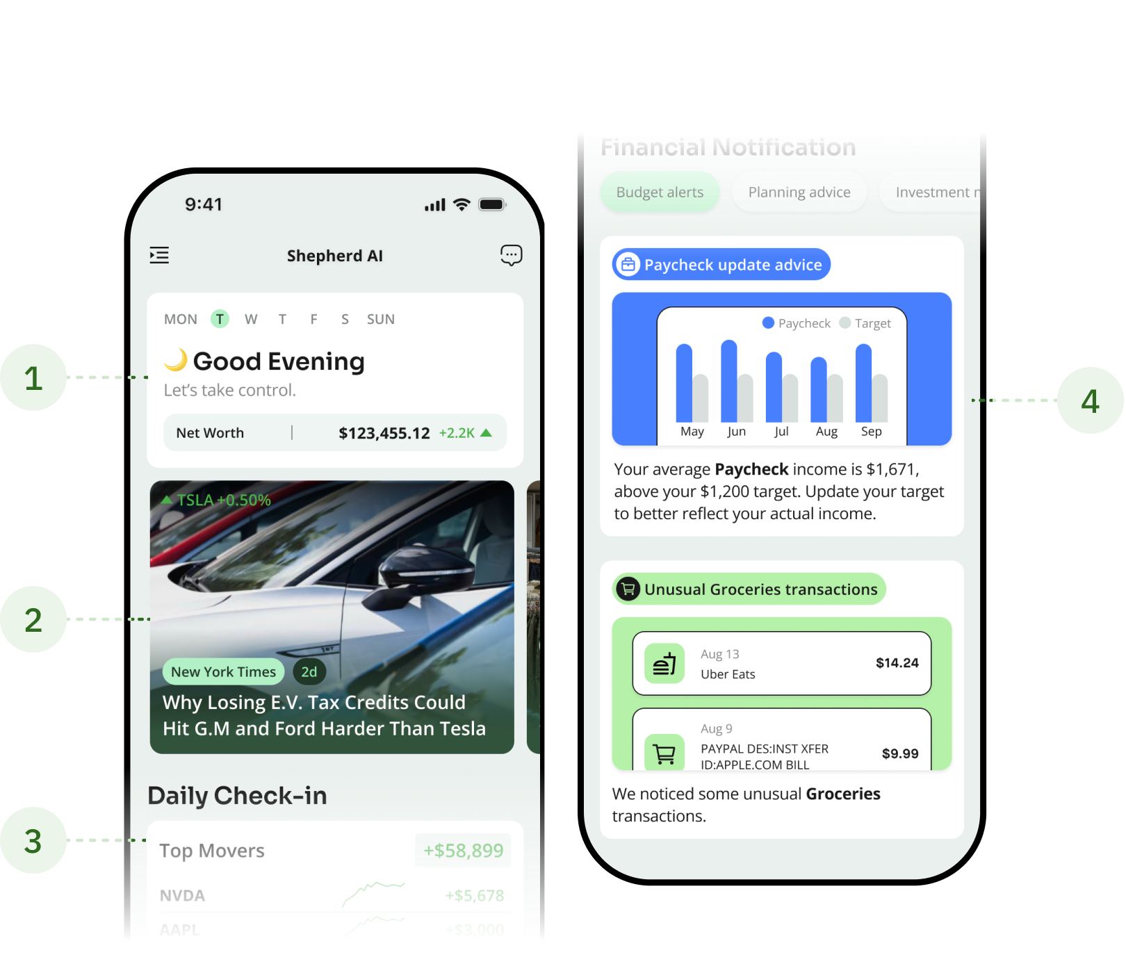
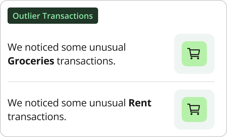
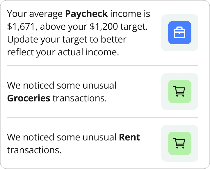
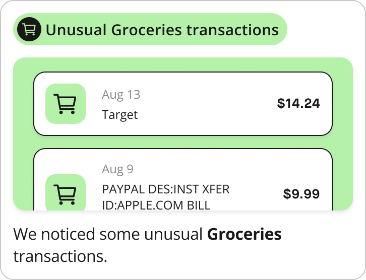
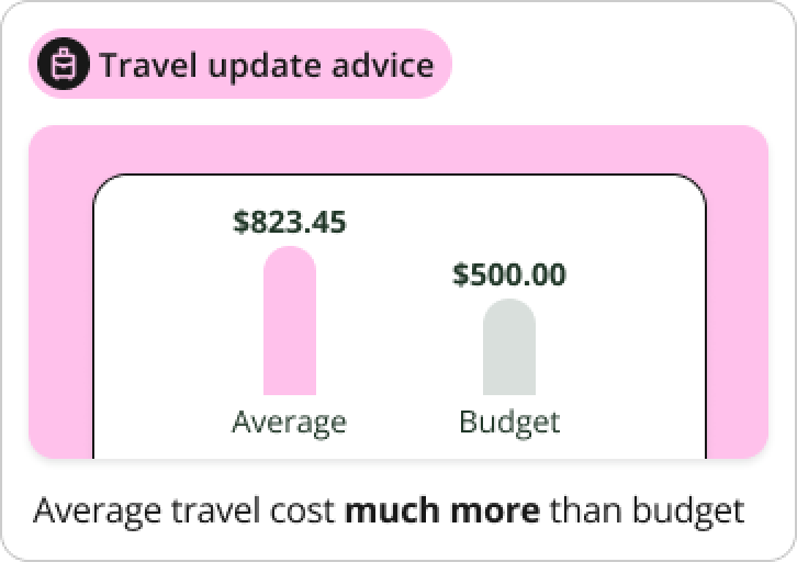
AI Financial News Feed
Delivering fresh content daily both AI-generated and team-curated. We encourage users to return regularly, discover timely insights
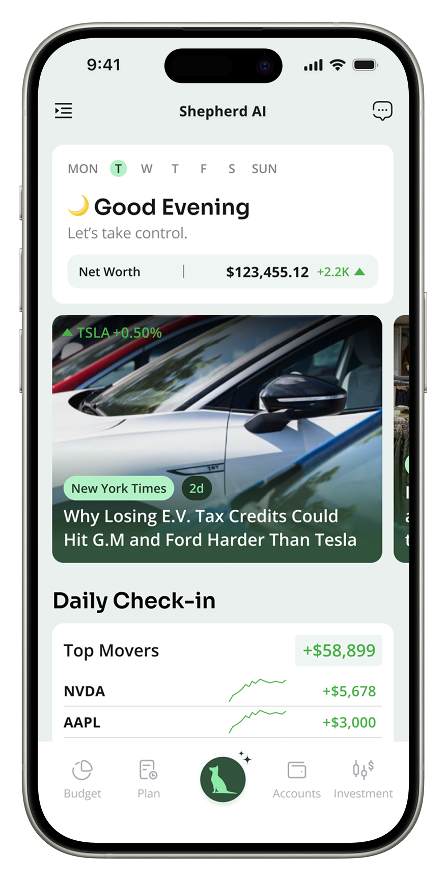
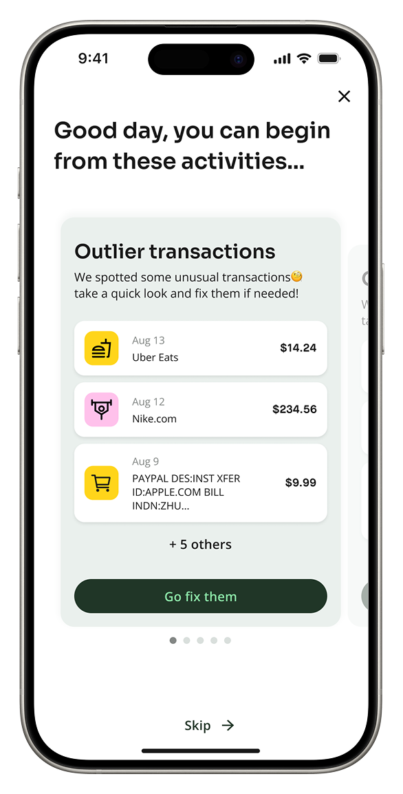
Daily Briefing
Proactive, personalized insights designed to be easily digestible — encouraging users to engage with AI before entering the app
02
Background
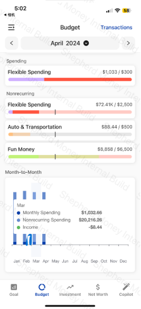
Copilot 1.0 — An Empty AI Tab.
Shepherd Money was founded in 2022 by three engineers to be an AI-powered alternative to traditional bank apps. By 2023, the team had shipped a standalone AI Copilot tab: open chat, blank input, “Ask me anything.”
But the data told a different story. Most users opened the tab once, faced the empty input, and never came back. The few who did type something asked for things AI couldn't yet do — or asked nothing at all.
WHAT THE TEAM HAD SHIPPED · AI COPILOT 1.0

03
The Thesis
Designing for AI Required Rethinking What a Financial App Feels and Looks Like.
In a finance app, AI is only useful if it makes the work feel lighter: fewer forms to fill out, fewer numbers to interpret, fewer questions users have to phrase perfectly.
That shifted the work in two directions: redesigning the interaction model so AI felt like part of the product, not a separate tool to operate; and rebuilding the visual system so it did not feel like one more generic banking feature.
FEELS LIKE
A place you visit, not a tool you operate.
From a blank chatbot tab to a daily news-style feed. Anticipating recurring questions instead of demanding them. Covered next in section 04.
LOOK LIKE
AI-native, not bank-native.
From sapphire blue to a tonal dark green. From Material defaults to a chart system that adapts to four AI contexts. Covered in section 05.
04
The Redesign
Stop Asking Users To Operate The AI.
With the system in place, I could finally rebuild the AI experience itself. The Copilot 1.0 had the wrong shape: it asked users to type a question before it would do anything. Eight user tests, eight blank inputs.
The fix wasn't a better chatbot. It was changing the AI from something you operate into something you visit: a daily, news-style feed of personal financial moments.
4.1
Synthesize
THE METHOD
From Asking to Anticipating.
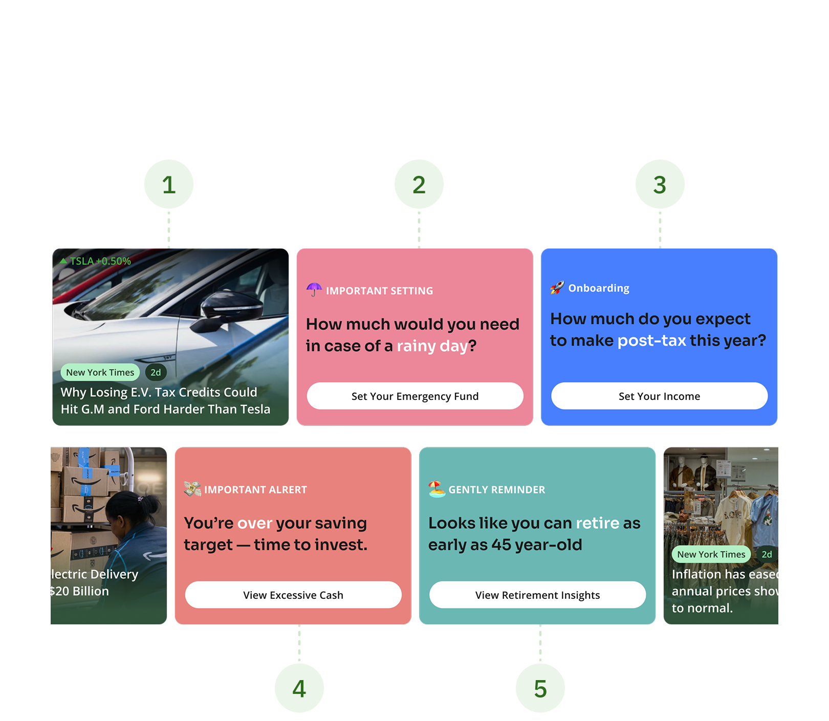
Our PM mined the chat logs: the few questions people did type clustered around four themes. If users couldn't think to ask, we could just bring those four themes to them.
RAW CHAT LOGS · 124 QUESTIONS
CLUSTERED · 4 NOTIFICATION TYPES
42%
Spending
23%
Budgeting
21%
Investments
14%
Planning
4.2
Prototyping
THE METHOD
Choose from 3 Proposals.
I mocked the four themes inside three different shells: a dashboard, a chatbot 2.0, and a notification feed. Then plotted them on the only two dimensions that mattered: information density and engagement effort.
PROPOSAL A
DASHBOARD
Pros: familiar shape, dense
Cons: static, passive, less interaction
PROPOSAL B
CHATBOT 2.0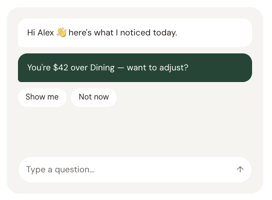
Pros: conversational, feels AI‑native
Cons: hard to scan, slow to scroll back
PROPOSAL C
NEWS FEED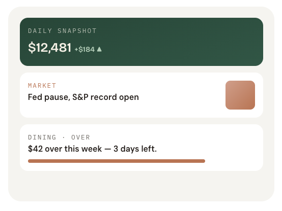
Pros: readable, daily‑fresh, easy scan
Cons: needs editorial content pipeline
DECISION LENS
Information density × user engagement.
The dashboard was dense but inert. The chatbot was engaging but thin. The feed sat in the top-right quadrant with high information and high engagement which is also where news apps live.
INFO DENSITY
ENGAGEMENT
A. Dashboard
B. Chatbot
C. Feed
4.3
Final Design
THE DEMO
Daily Financial Feed.
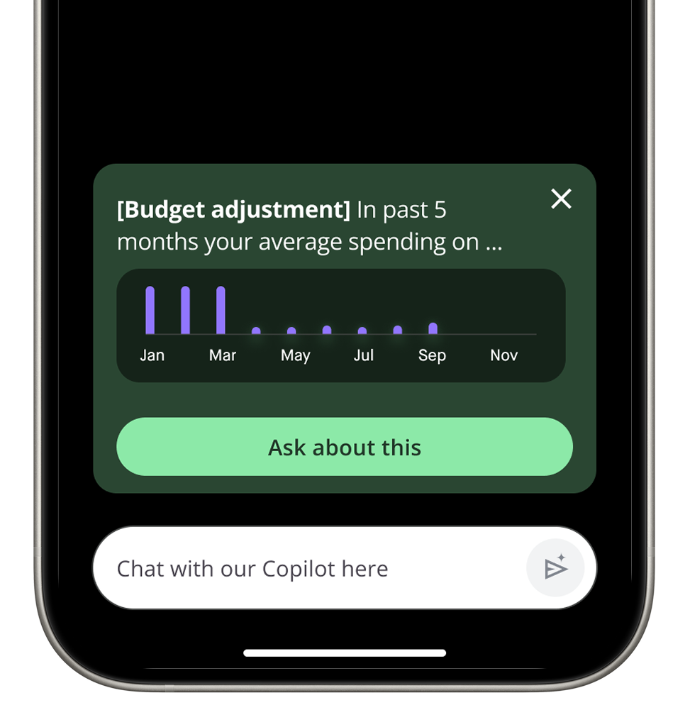
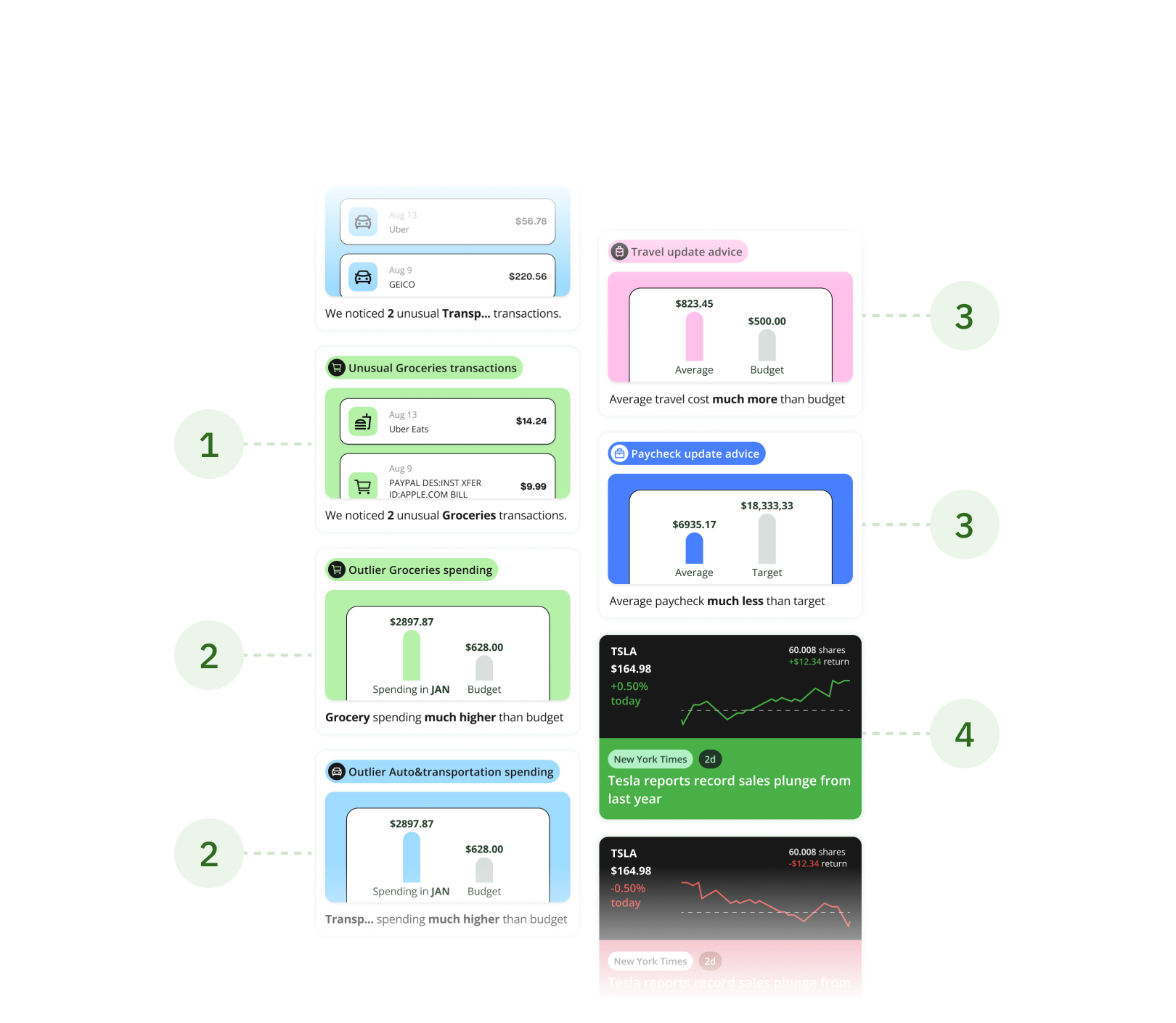
Our core differentiator, delivering fresh content daily both AI-generated and team-curated. We encourage users to return regularly, discover timely insights, and engage with high-value information effortlessly.
THE HIGHLIGHT
3 Layers of the Feed.
4.4
Iteration
THE METHOD
The Constraints That Shaped The Cards.
Before reaching the final design, we explored multiple directions and refined the solution under both technical and product constraints.
TECHNICAL CONSTRAINTS
When half the cards have no image.
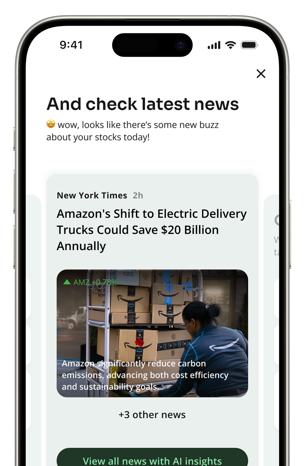
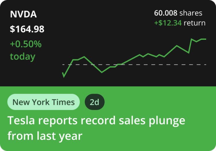
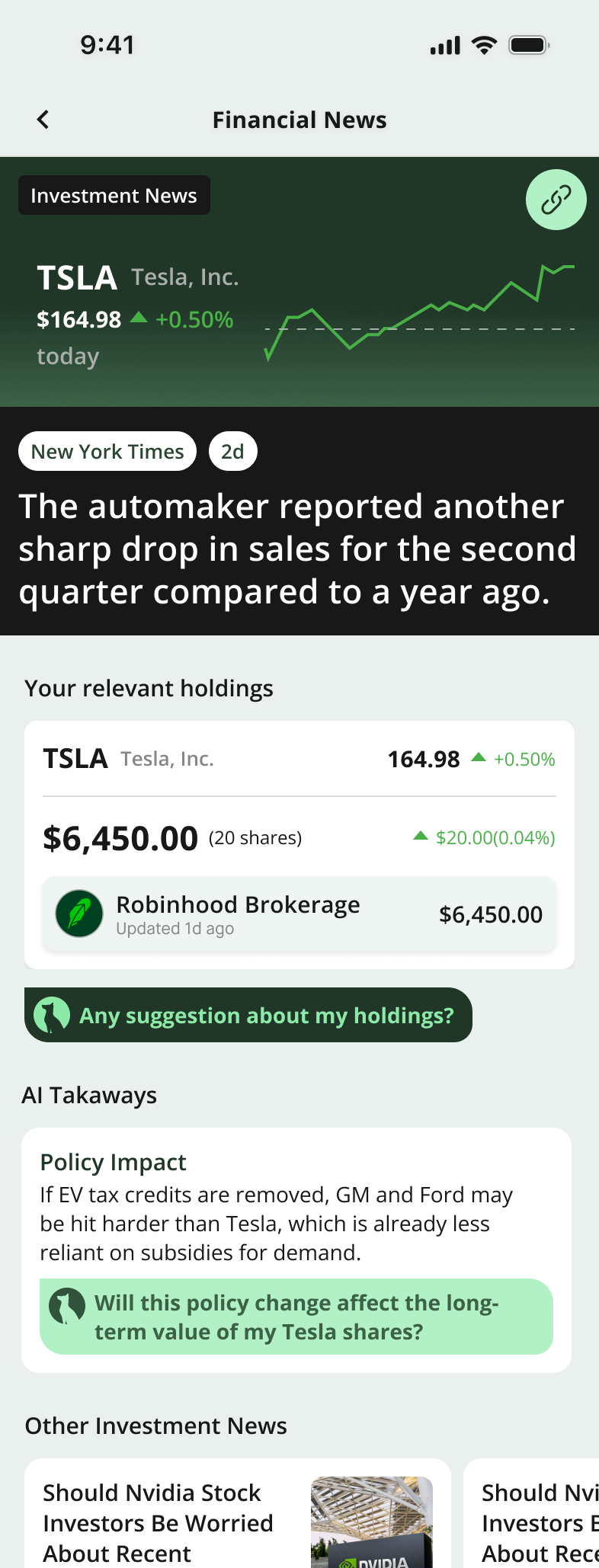
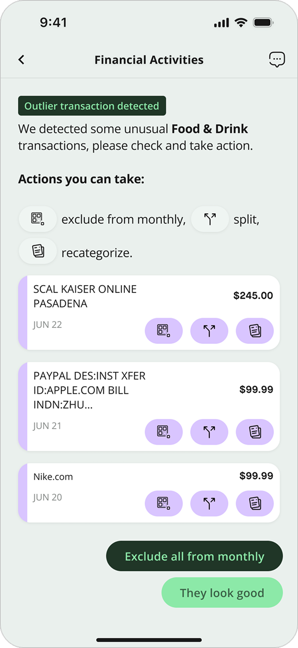
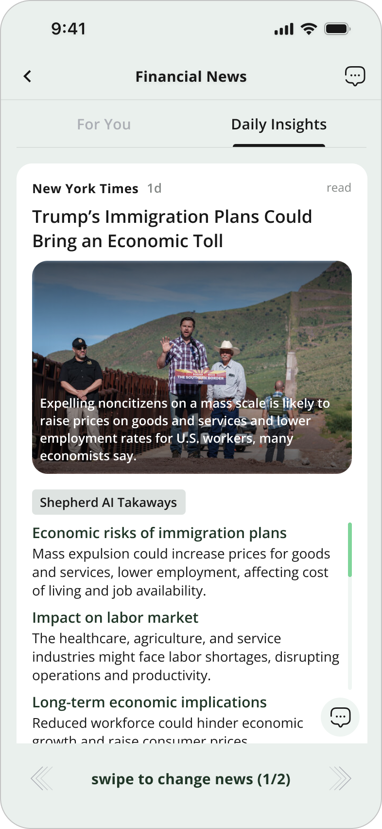
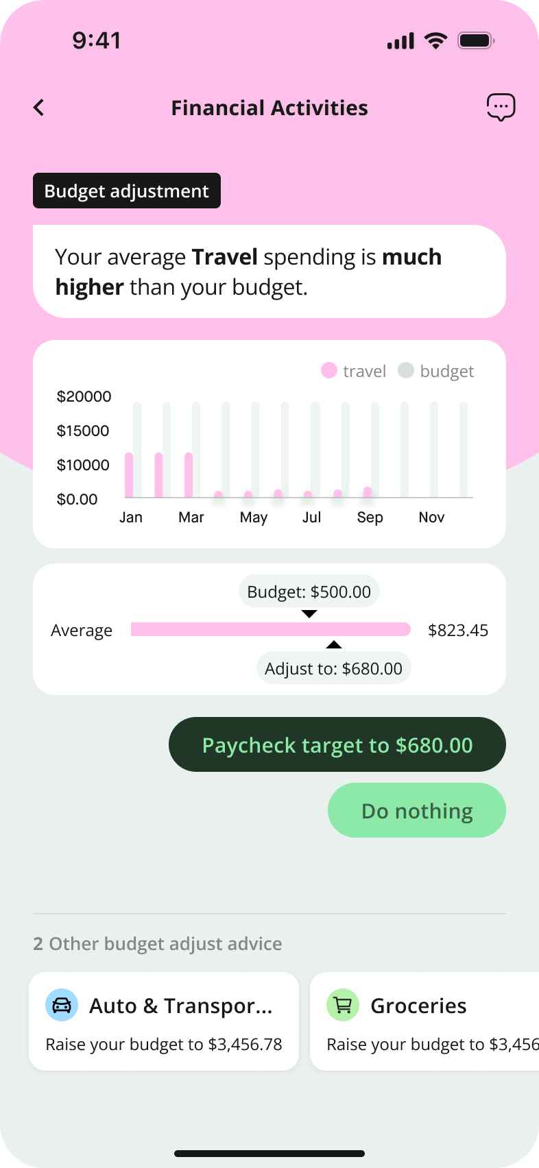
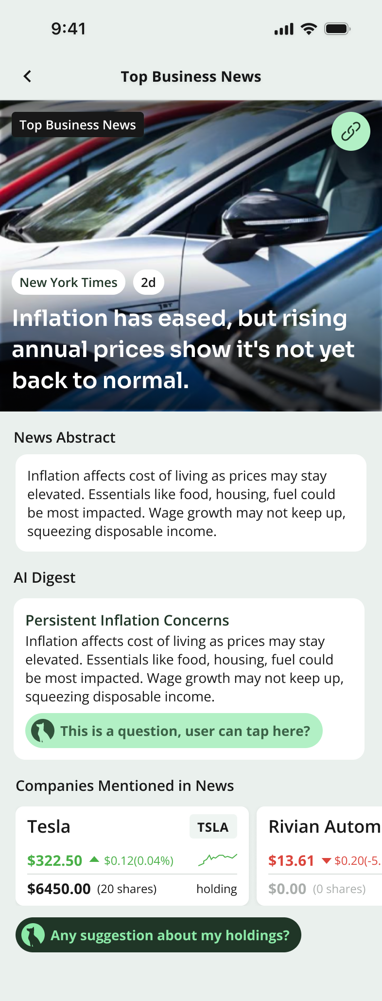
Our content pipeline only provided image assets for top business news articles. For investment news (news tied to user's personal holdings) we had no reliable images. This created an inconsistency: some cards looked rich and engaging, while others felt empty and less credible. To address this, I designed two separate sets of news cards and detail pages.
News Card Iteration
GENERAL NEWS CARDS


TOP BUSINESS NEWS

+
PERSONALIZED NEWS
News Detail Page Iteration
GENERAL DETAIL PAGE
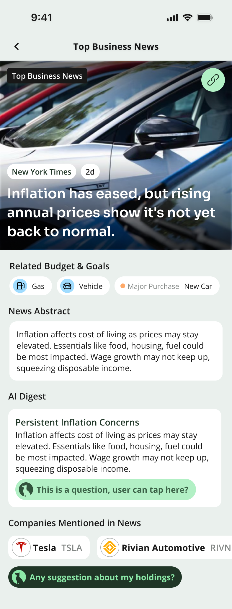
TOP BUSINESS NEWS

PERSONALIZED NEWS
PRODUCT JUDGEMENT
Engagement ↔ efficiency.
We explored two extreme versions: one that was overly simple, which failed to engage users, and another that was overly complex, which made interactions inefficient. The final design strikes a balance between clarity and engagement.
From Overly Simple to Visually Engaging

From Overly Complex to Efficient Interactions
05
Visual System
A New Visual Language For AI-First Fintech.
The redesign couldn't ship inside the inherited sapphire-blue, Material-ish shell — the AI surfaces would have read as one more bank widget. So I rebuilt Shepherd's visual system in parallel with the AI work, three months ahead of the feed launch.
Three moves did most of the work: a new color palette, a chart system that adapts to AI context, and Figma-variable-driven theming. Together they gave every later AI surface a place to land.
5.1
Color Palette
THE CHANGE
From sapphire blue to a tonal dark green.
The old palette borrowed authority from traditional banks. But Shepherd's actual job is proactive AI guidance which needed a color that suggested growth and clarity, not vault-and-pillar weight. We benchmarked Chase, BoA, Robinhood, NerdWallet, Rocket Money, RAFA, and OpenAI, then chose dark green for the same reason NerdWallet does: trust + growth without needing a graphics team to maintain it.
SHEPHERD 1.0
SAPPHIRE | BANKING CONVENTIONS
SHEPHERD 2.0
DARK GREEN | TRUST & GROWTH
THE CHANGE
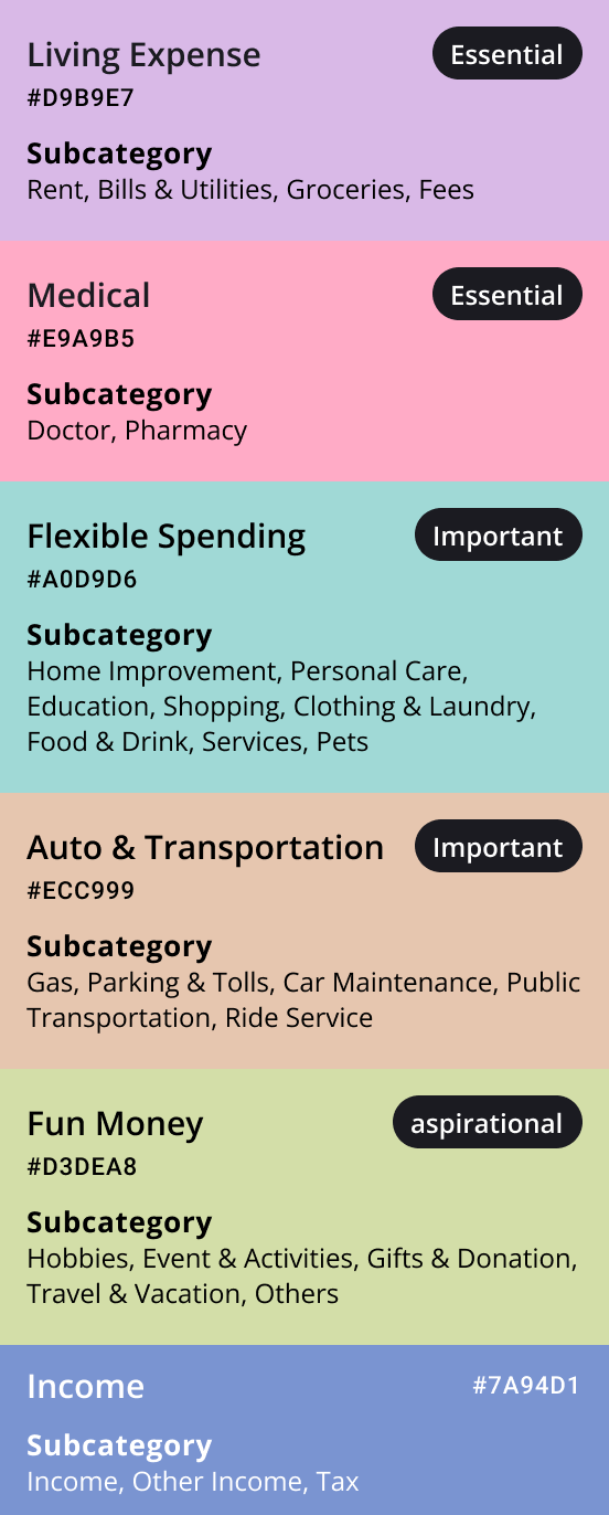
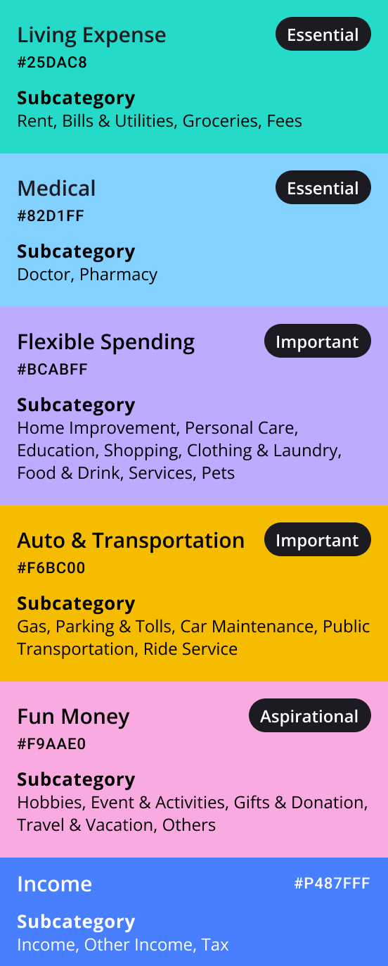
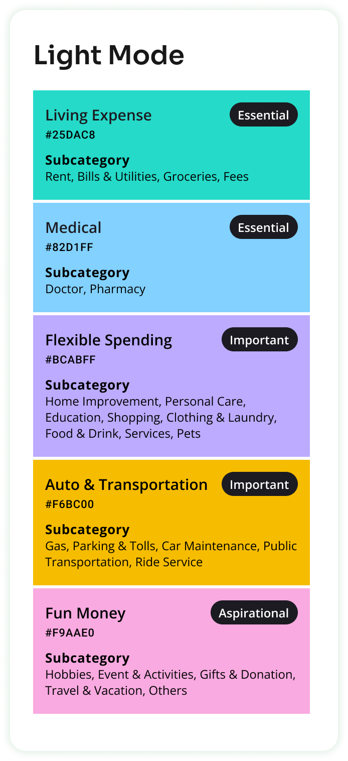
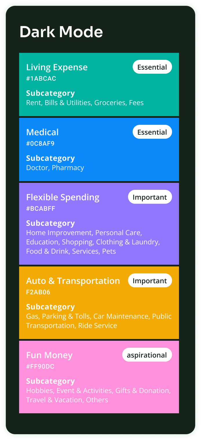
Color Coding Categories.
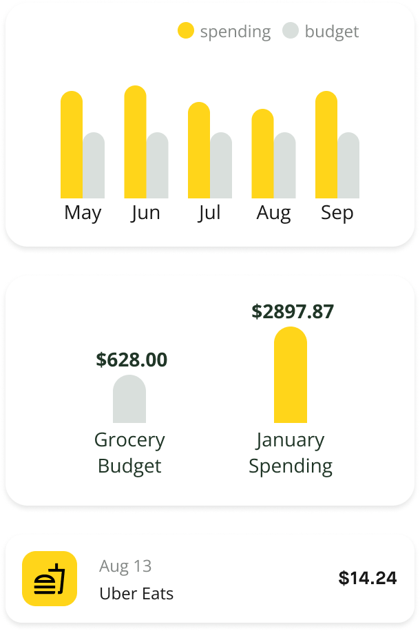
Tracking spending & budgeting is a core feature of our app — users frequently interact with multiple category colors. To ensure clarity and usability, I avoided primary colors and prioritized text contrast on category chips.
Initially, I explored lighter tones for a fresh look but found them too subtle — users skimmed past them, so I opted for more vibrant colors.
THE CHANGE
Dark Mode Optimization.
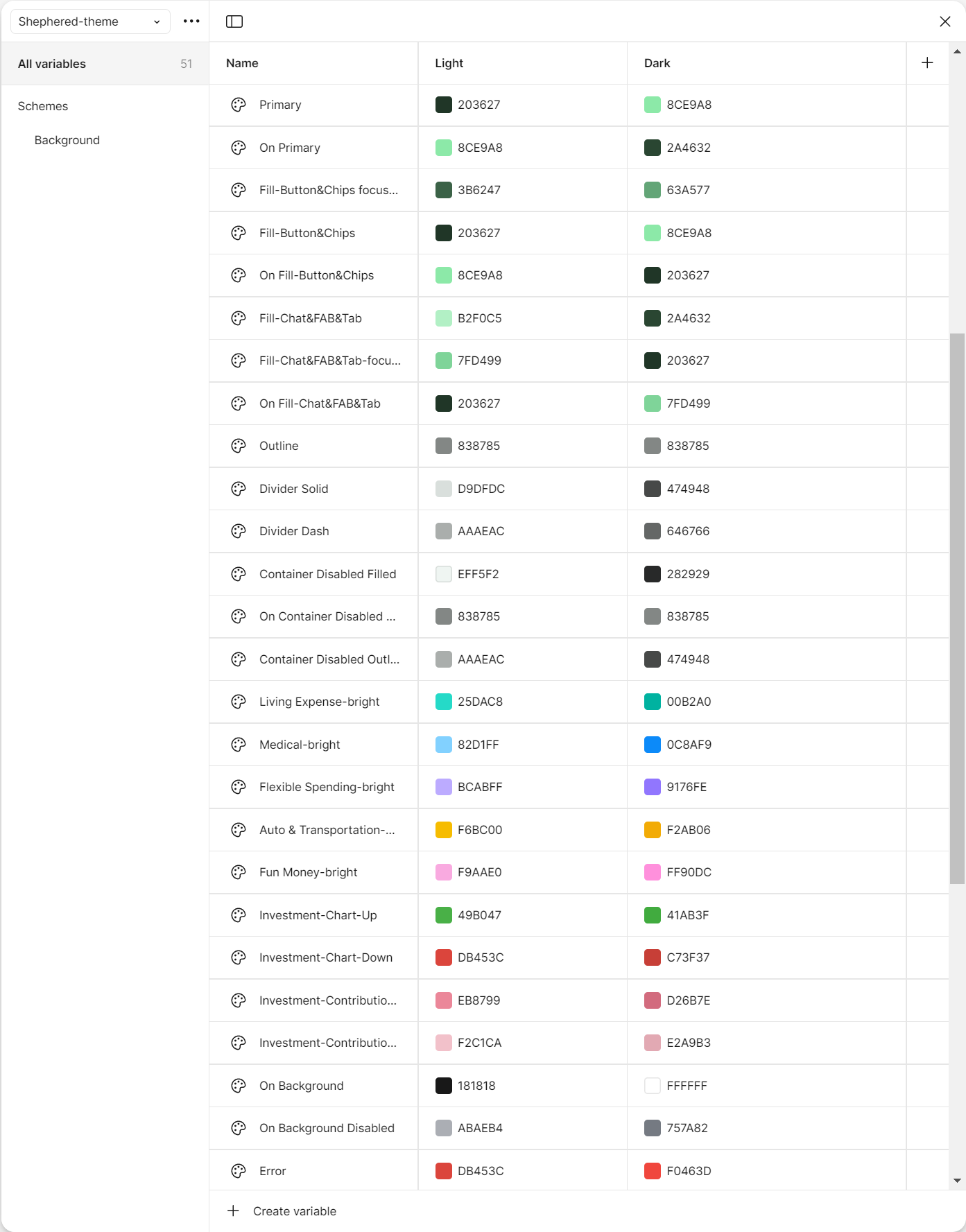
I moved the team onto Figma variables — one set of semantic tokens (surface, on-surface, primary) bound to two value modes.
Switching the whole product to dark mode became a one-click toggle rather than a duplicate design file. Engineers got the same separation in code.
5.2
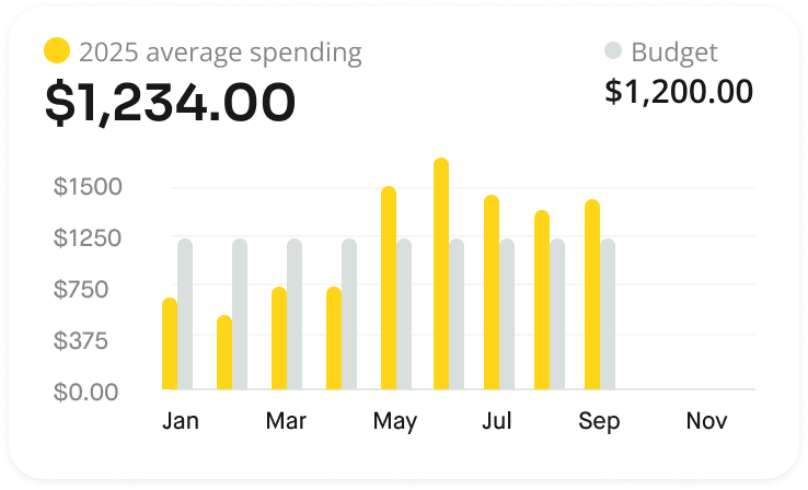
The Charts
THE CHANGE
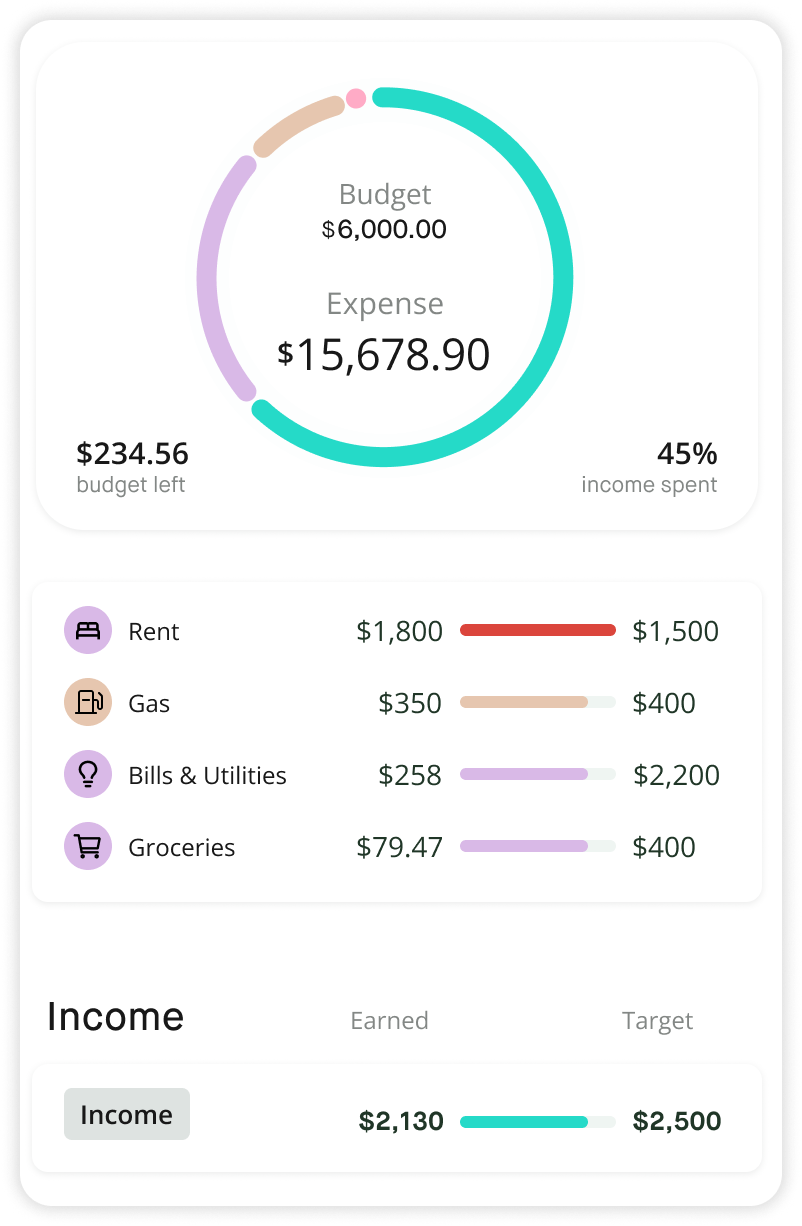
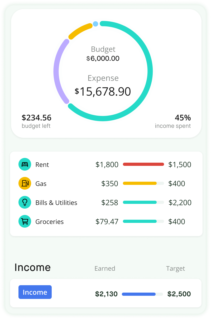
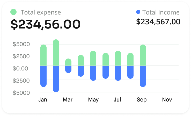
One Source of Chart, Four AI Contexts.
Charts had to do multiple duties: precise enough for the spending screen, glanceable enough for an AI alert card, conversational enough for the chat bubble, and detailed enough for AI advice. So one source chart should contain four context-specific variations.

06
Outcomes
What Will The Rebuild Produce:
TARGET METRIC 01
Daily Engagement Rate
A feed gives users a reason to open the app daily, where the Copilot tab gave them none. The hypothesis: a guaranteed daily read replaces an occasional, effortful query.
TARGET METRIC 02
DAU / Retention
Fresh, personalized content every morning is the same loop news apps use to earn the daily habit. The bet was that finance, framed as news, could earn it too.
07
Reflection
What I’ll Do Differently
I was designing for AI, but I was not yet fully using AI in my own design process.
At the time, I committed to the notification-feed direction early and focused the team’s energy on making that concept strong. It worked, but looking back, I would spend more time widening the exploration before narrowing in.
The project taught me that AI works best when it reduces effort and expands what is possible for users. Today, I would apply that same lesson to my own design process.
01
Generate More Directions
Instead of testing three concepts, I would use AI to quickly explore a wider range of interaction models including directions I may not have sketched on my own.
02
Validate Earlier
I would use AI-assisted research tools to run and synthesize more lightweight user feedback before committing to one direction.
03
Commit Later
I would keep the decision open longer, compare alternatives more fairly, and let stronger evidence guide the final direction.