- HEALTHCARE
- DATA VISUALIZATION
- B TO B TO C
Generation LabSystemAge Report
Turning a report people read once into one they return to. For the SystemAge 2.1 launch I redesigned the biological-age report around a new Trend View, and reworked the most-visited Overall Health page.


01
Introduction
Turning a Dense Lab Report into a Product People Actually Read
SystemAge™ is an at-home DNA-level blood test that measures biological age across 21 organ systems. The results live in a multi-page report inside both the client and clinician portals.
The previous version was scientifically strong, but hard to use: 40+ pages of dense charts, technical copy, no history, and no easy way to navigate.
I led the report redesign end-to-end as the only designer, working with our PM, two engineers, and the science team. The challenge was turning a research-grade data pipeline into a report that clients could understand quickly.
ROLE
Product Designer
Lead end-to-end
DURATION
2 Sprints
4 weeks in Apr'26
TEAM
PM, Eng, Founders
Cross-functional
DEVICE
Mobile + Desktop
PDF in Web Portal
02
Scope
SystemAge™ 2.1 Release
The 2.1 release added to the report structure — longitudinal trends and sex-specific calibration — and adjusted the color thresholds that decide when a system reads as optimal, normal, or worth monitoring. My work focused on making those additions land while keeping the report easy to read.
REVAMP SCOPE
- 01Trends Over TimeNew in 2.1
- 02Trends of 21 SystemsNew in 2.1
- 03Overall Health: SystemAge & BioNoiseRedesign
03
The Thesis
Add Information Without Adding Confusion.
I held every visualization to two axes: accurate (does it respect what the science can claim) and legible (readable in seconds). The following pieces of the report carried the most weight, and each answers that question differently.
Feature 01
Trends Over Time
WHAT IS IT & HOW I BUILT IT
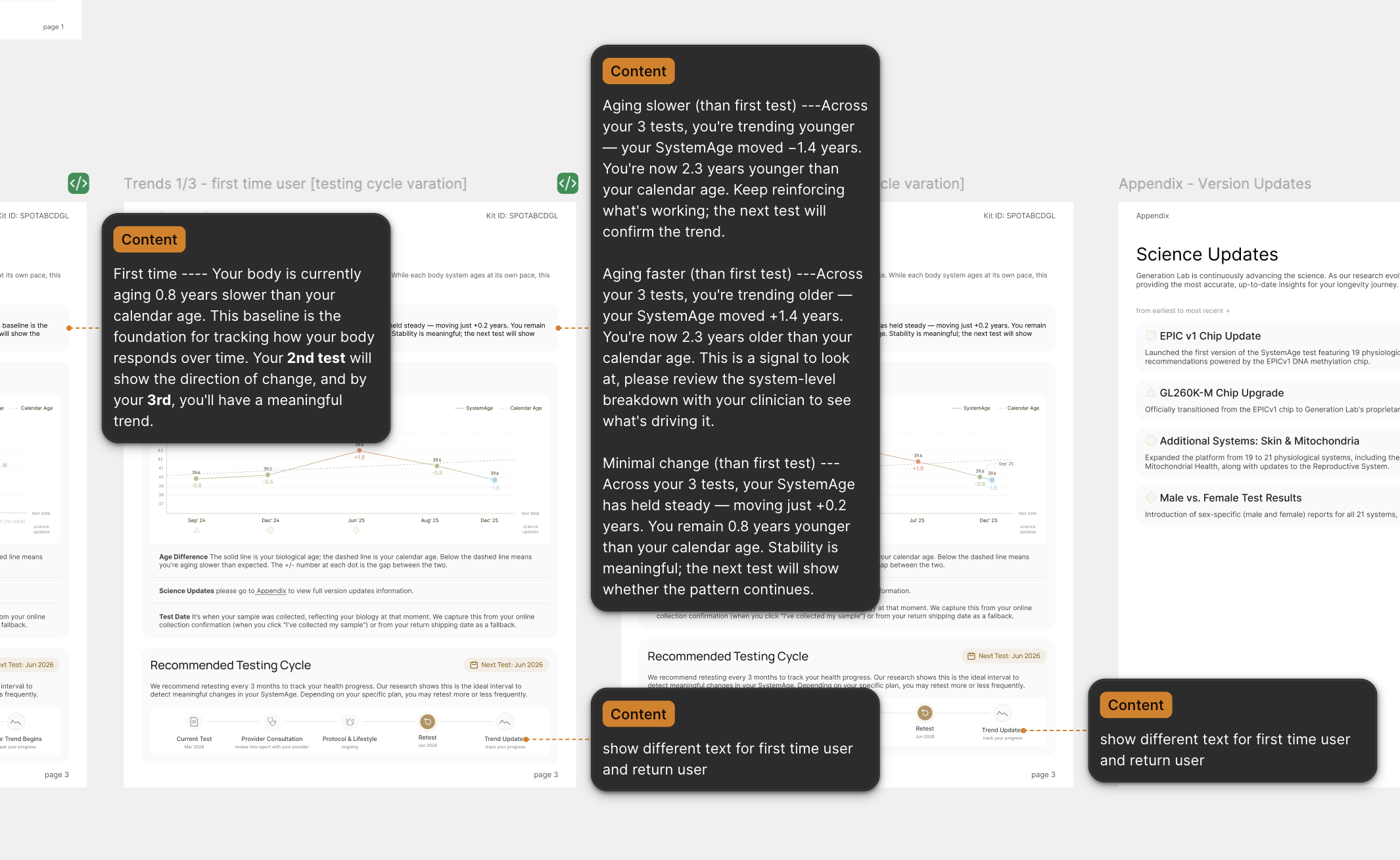
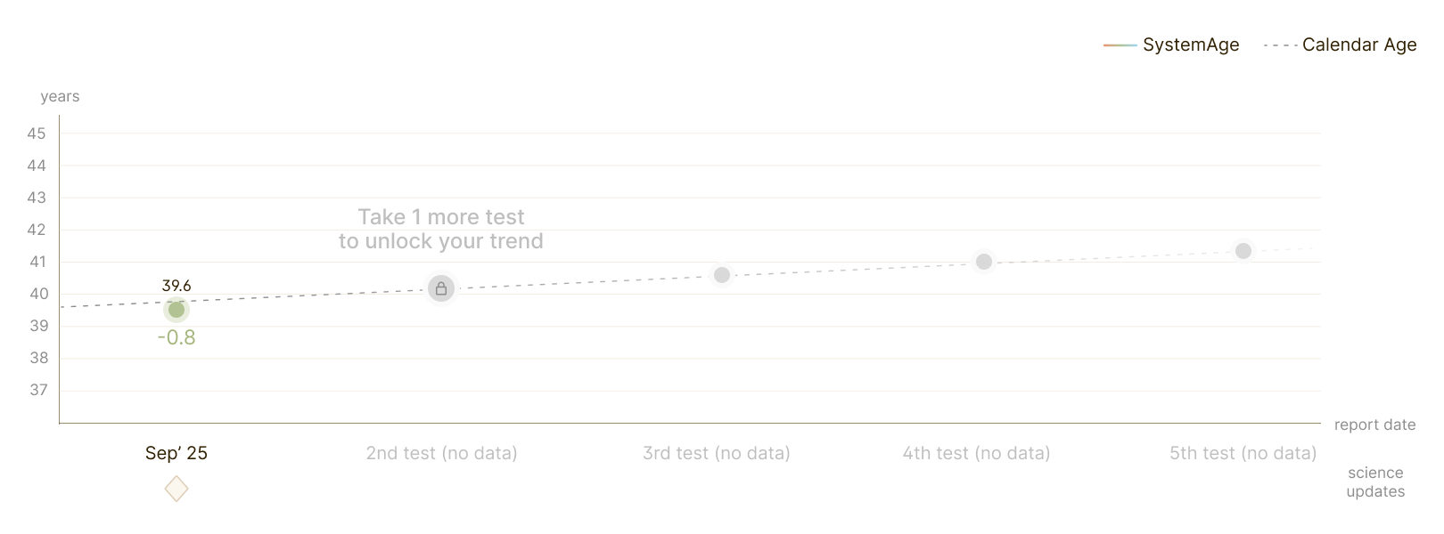
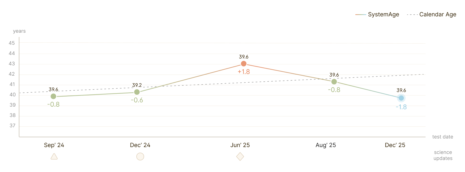
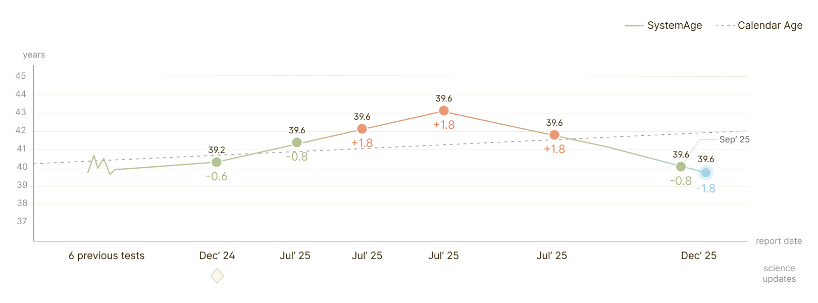
A Trend That Adapts to Test History Numbers
Longitudinal testing means the same chart has to serve someone on their first test and someone on their fifteenth. Show too little and it's useless; plot everything and it collapses into noise. Rather than design one screen, I wrote density rules that let the chart degrade gracefully as data accumulates.
TREND VIEW VARIATIONS
Feature 02
21 Systems
Trend View
WHAT IS IT & HOW I BUILT IT
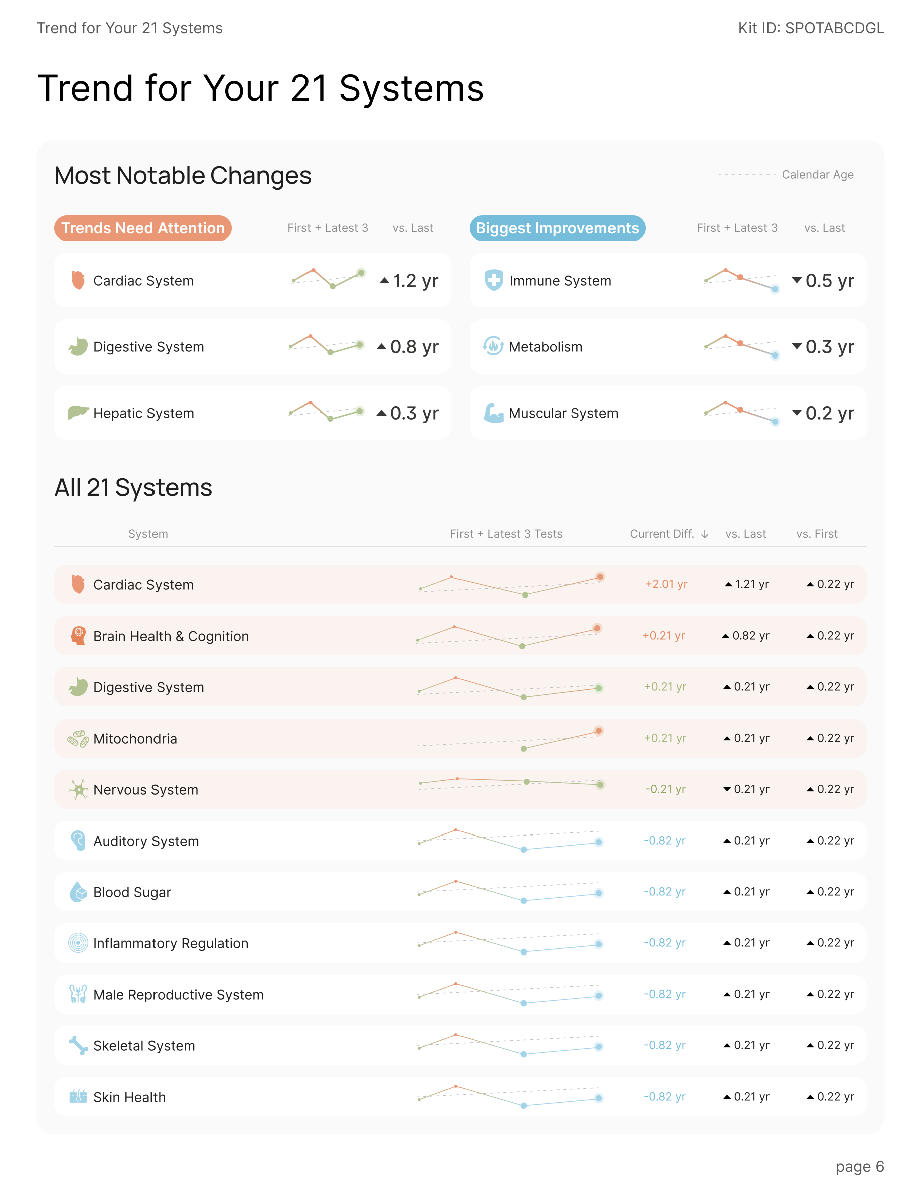
Preview Page of Trends for All Systems
This page gives a glance of what changed everywhere since last time. It leads with the three trends that need attention paired against the three biggest improvements, then lays out all 21 systems in one scannable table.
Feature 03
Overall Health
WHAT IS IT & HOW I BUILT IT
Overall Health: the Most-Visited Page
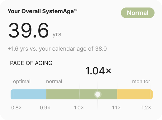
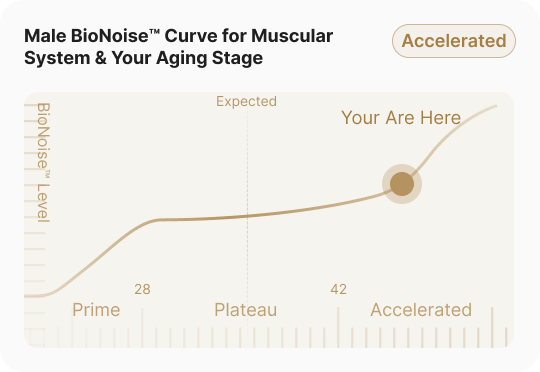
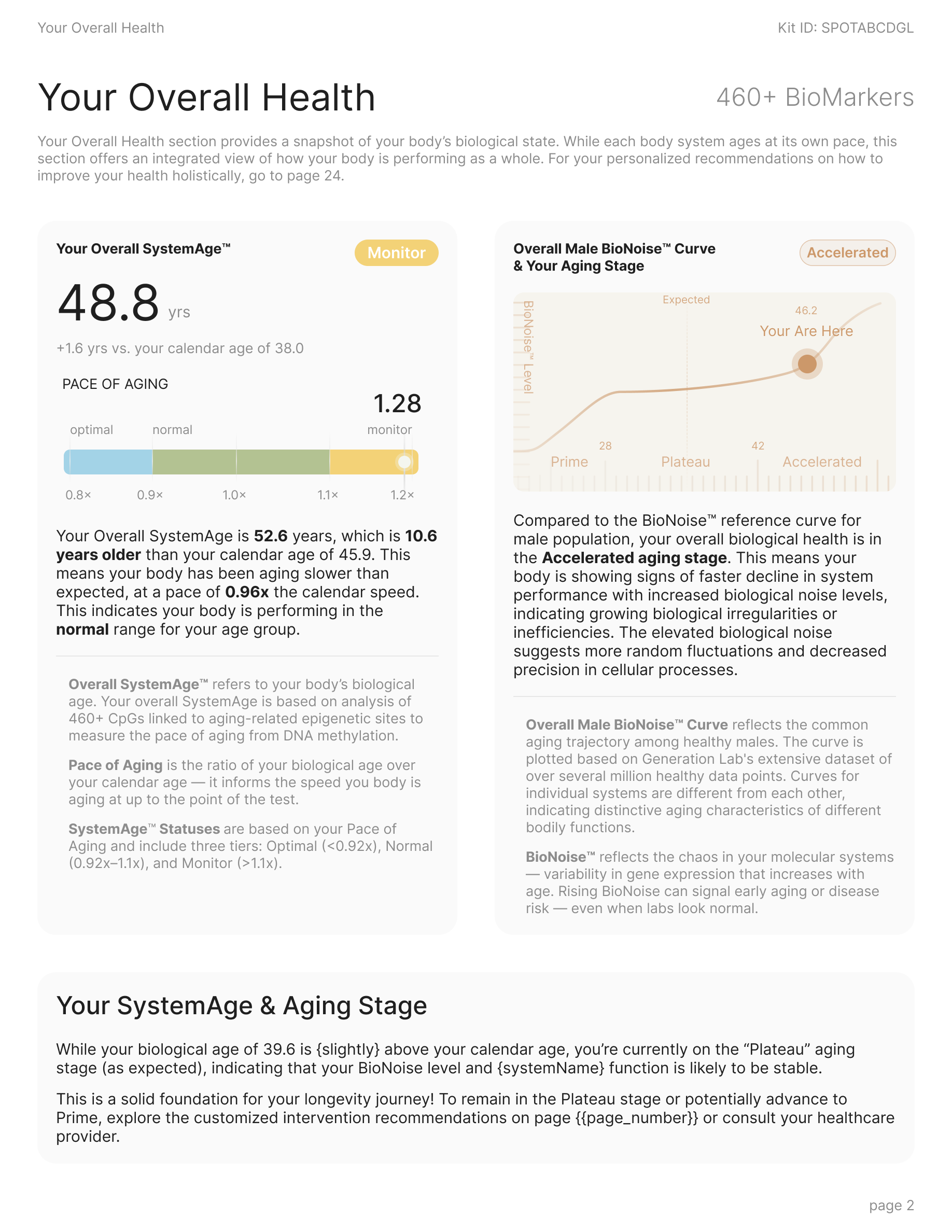
The Overall Health page is the report's home base — it is the page people return to most. Two abstractions carry it: your overall SystemAge™(how old your biology reads, and how fast it's moving) and the BioNoise™ curve (where you sit on the aging trajectory). Get these two right and the rest of the report makes sense.
The previous version expressed everything through a similar color gradient graph, but it asked the reader to decode a colour with no scale. And the connection between these 2 graphs is unclear.
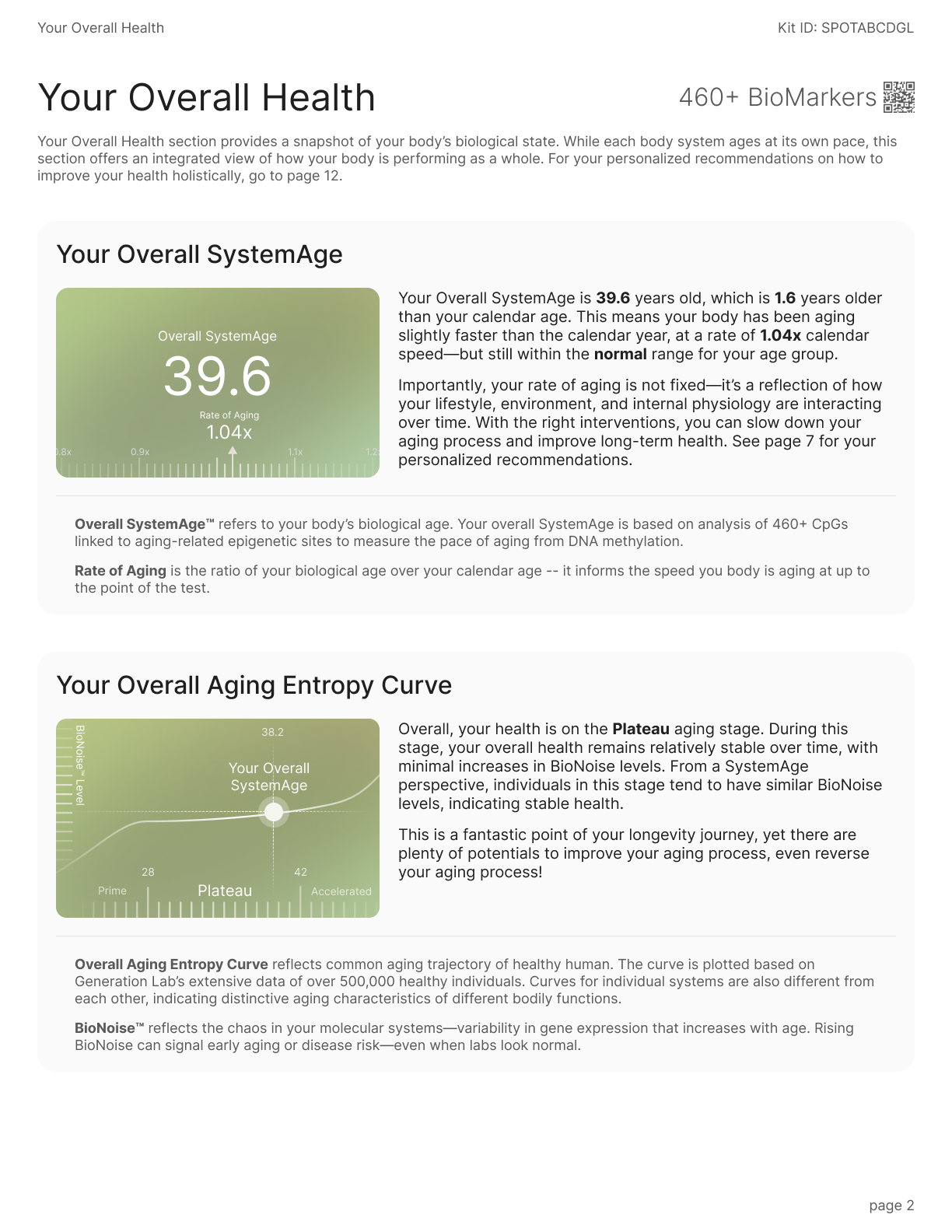
I rebuilt the page around two explicit ideas: a labelled pace-of-aging scalewith named status tiers, and a BioNoise curve with named life stages and a “you are here” marker.
04
Outcomes
1 Early Signal & What We’re Tracking
The feature launched only days ago, so the honest picture is one strong early signal and a set of clearly-defined metrics we’re now watching.
THE EARLY SIGNAL
100+
Kits sold at the Dave Asprey event
The audience saw a sample of the redesigned report on stage, and the booth sold 100+ kits off the back of it. The report became the pitch — the clearest proof so far that the redesign reads at a glance, even to a first-time audience.
What we’re tracking: defined now, measured post-launch
Retest rate
Return for the trend view
The retest loop is the whole bet behind trends. We're tracking the share of users who book a second test after the announcement — measurable once the first retest window (~6 months) opens.
TARGET · RETENTION
Support
“What does this mean?” tickets
If the redesign works, confusion-driven support tickets per report should fall. We're baselining against previous volume to measure the drop.
TARGET · SUPPORT
05
Reflections
The Design Isn’t Done Until Engineering Can Build It Twice.
My biggest growth on this project happened after the “design” was finished. When I handed the report to engineering, two pieces of feedback reframed what handoff actually means — and changed how I document every project since.
Here are some of the initial pieces of feedback:
From PM
“The visuals are clear, but there's not enough measurement. Eng is guessing the gaps between cards and the padding, and several builds come back slightly off.”
From Front-End Engineer
“I can see what it looks like, not why. Leave me the logic: how the chart decides what to draw, where the colors come from, how the copy is built.”
Both were right. A beautiful frame with no spec is a suggestion, not a handoff. I rebuilt the delivery into two layers: a redlined spec for measurement, and an engineering notes doc for logic.
Redlined Spec
Every necessary gap, padding, and radius annotated so the build matches the design to the pixel.
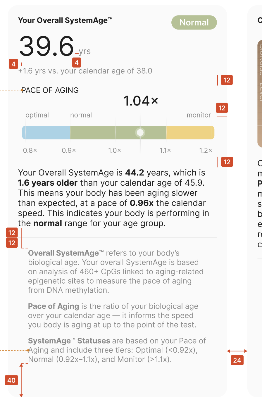
Notes for Engineering
Chart generation logic
No trend. Render the value + a ghosted “next test” projection — never a line from one point.
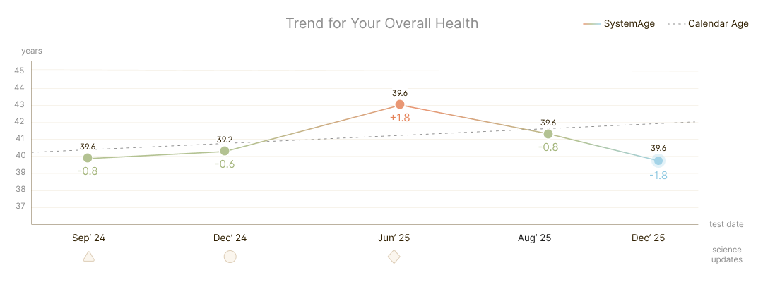
Full detail: value + Δ-vs-calendar-age on every point, dots at r 8.
Thin out: x-labels every 3rd, dots → r 6. Min gap between dots = 2 px; add a date indicator if the gap between two dots < 8 px.
Color value logic
Copy Logic